
Case Study
Kueski: Redesigning the Repayment & Activity Experience
As a Staff Product Designer leading the Money Movements and Repayment experience at Kueski, I spearheaded a comprehensive, end-to-end redesign of our mobile repayment flow and transaction tracking.
Moving from initial benchmarking to a full production launch, this project unified a fragmented ecosystem, strategically shifted user behavior, and established a scalable, data-driven foundation for our mobile product.
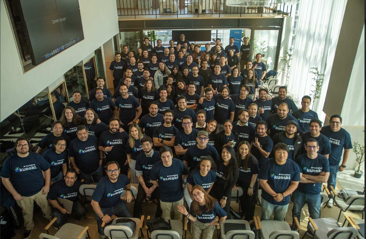
Role: Staff Product Designer
Goal: Repayment module full redesign
Timeline: 2025 – 2026
Platform: Mobile (iOS, Android), Web.
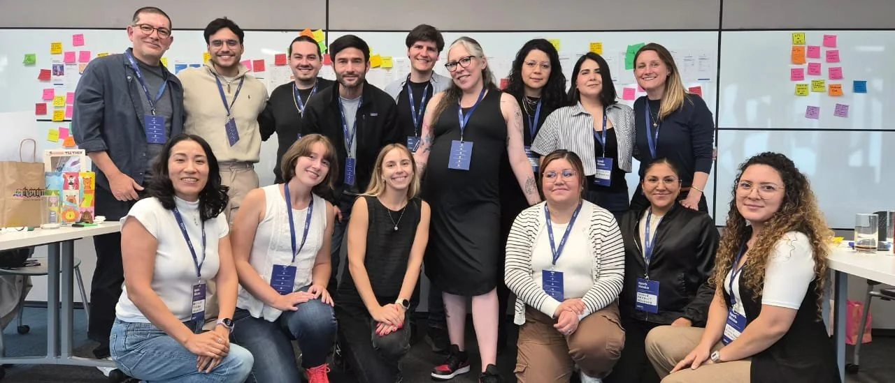
“Mexico’s premier fintech ecosystem. We transformed high-friction lending into “human-speed” digital experiences, balancing complex machine learning with intuitive design for millions of users.”
The Challenge: Redesign the repayment experience
Our existing repayment experience had grown fragmented over time, leading to severe cognitive load for users and rising operational overhead for the business.
Through close collaboration with the Customer Service team, we captured the raw, real-world pain points they handled daily. Their insights were key to understanding exactly where the interface was failing and where we needed to focus our attention:
The Clarity Gap: When accessing the app, users were fundamentally unsure of exactly how much they owed Kueski.
The Post-Payment Anxiety: After completing a payment, the interface failed to clearly indicate which specific loans or purchases had been repaid, leaving users in limbo.
The Information Overload: The interface was cluttered with confusing and unnecessary financial data, which amplified user anxiety rather than resolving it.
Navigating Constraints: The Payment Dilemma
During the discovery phase, a critical friction point emerged where user convenience stood in direct opposition to business sustainability:
The High-Cost Comfort Zone: Users preferred paying directly via debit cards in the app using gateways like Stripe and Conekta. While frictionless for the user, these payment methods incurred very high transaction costs for Kueski.
The Low-Cost Anxiety Trigger: The most cost-effective method for Kueski was Direct Debit (Domiciliación). However, this was the least preferred method for users. They feared missing payments due to lack of funds on the exact draft date, and they experienced anxiety because the payment was not reflected immediately in the interface.
Research & Discovery: Fintech Benchmarking
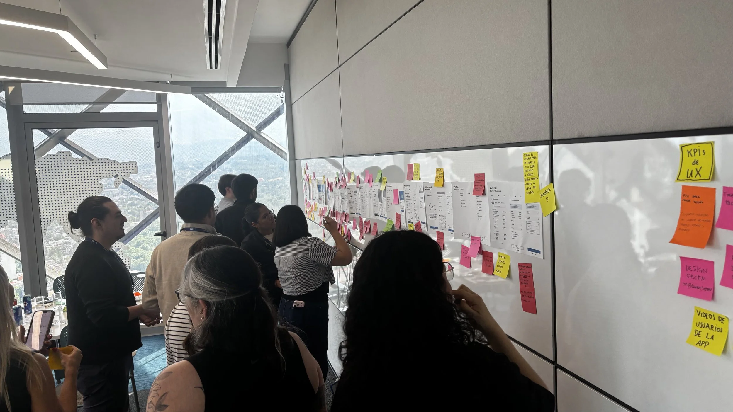
Before putting pen to paper, I conducted a rigorous competitive benchmarking analysis to understand how leading global fintechs, digital banks, and buy-now-pay-later (BNPL) platforms handled high-anxiety payment flows.
Deconstructing Mental Models: I analyzed industry-standard interaction models around transaction confirmation, payment status delays, and complex ledger layouts.
Identifying Best Practices: The goal was to isolate the exact patterns that successfully balanced massive amounts of data with minimalist, clear visual hierarchies.
The Insights: This research directly informed our strategy, highlighting that the best financial interfaces use progressive disclosure and robust status messaging to build trust during processing lags—setting a benchmark for where Kueski needed to go.
Deep Dive: The Repayment UX & Interaction Redesign
Designing "Direct Debit on Demand"
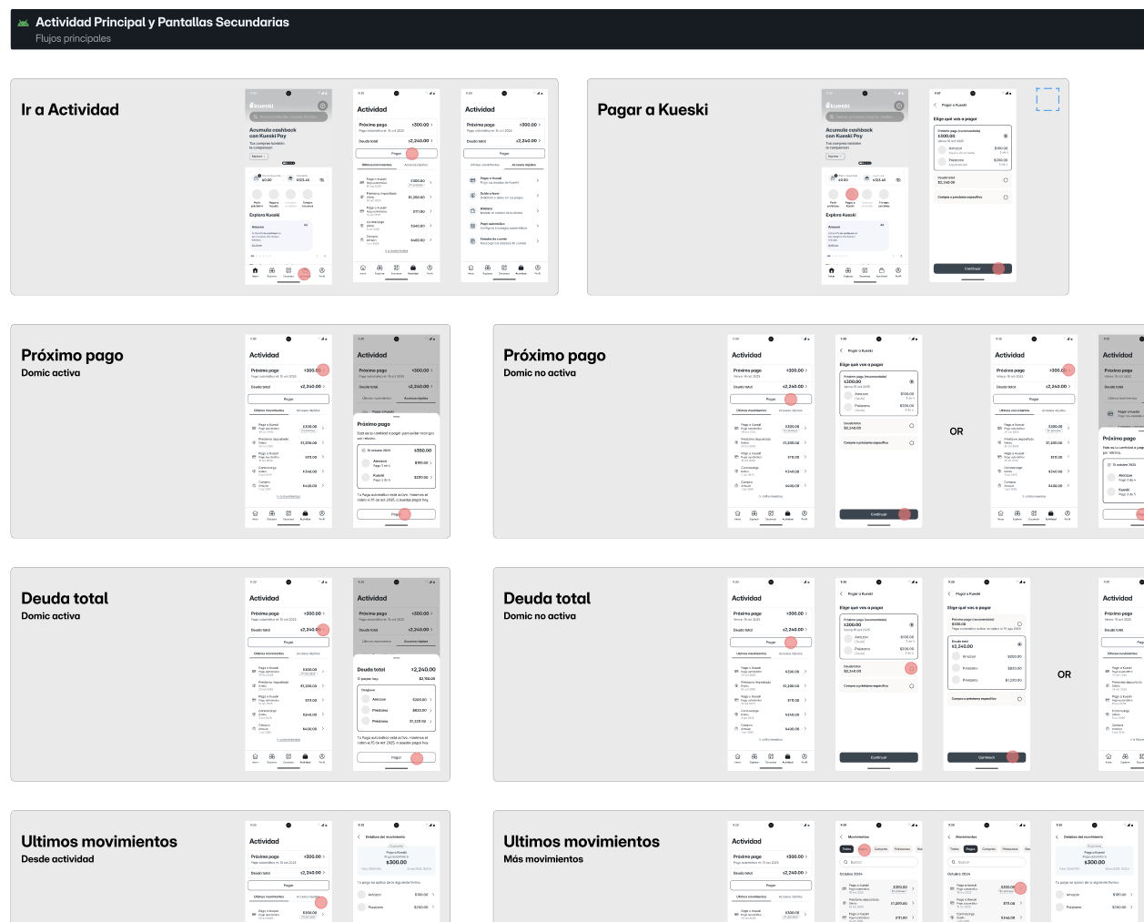
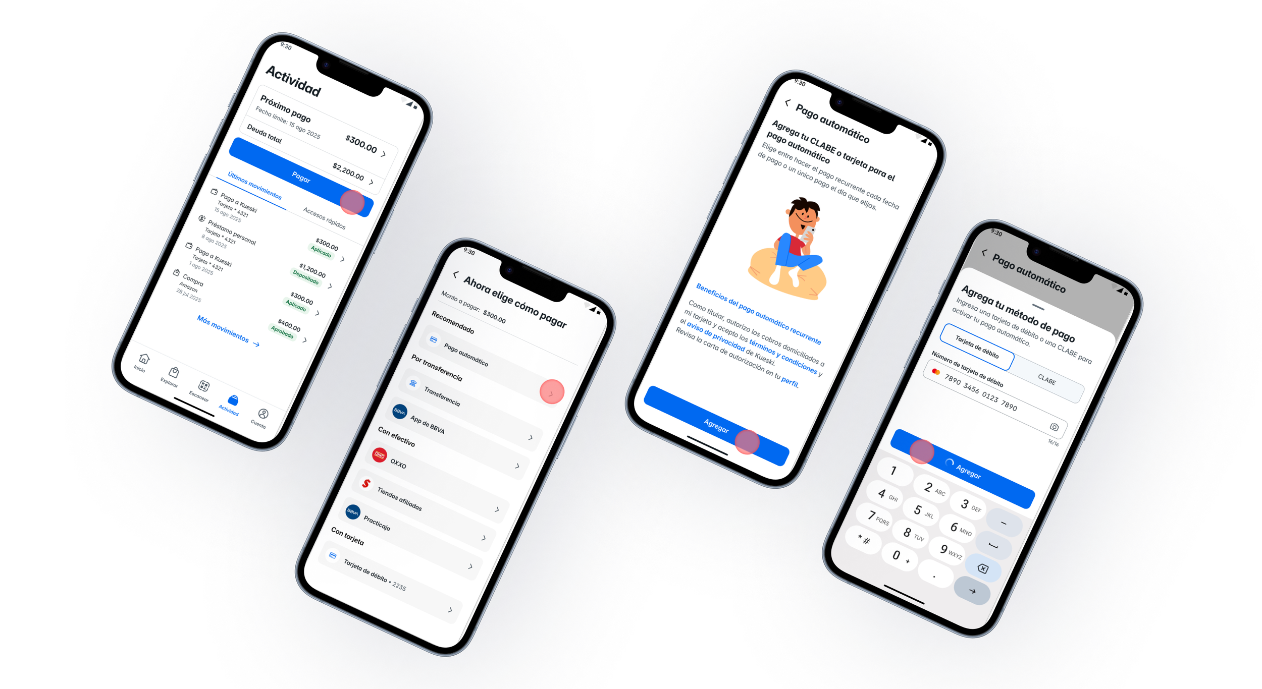
Instead of forcing a rigid auto-debit system, I designed an on-demand flow.
Interaction Model: I optimized the interaction architecture to ensure that initiating a Direct Debit on Demand required the exact same number of taps as a traditional card payment, removing any perceived transactional friction.
Visualizing the "Black Box": To replace the anxiety of slow backend processing, I designed explicit, real-time transactional status components within the app. Users could instantly see an "In Process" state, giving them immediate feedback that their action was successful.
To solve this friction, I didn't just redesign screens—I orchestrated a new behavioral model. The goal was to design through user anxiety, treating the lower-cost mechanism with the same premium UX as a premium card payment.

Closing the Feedback Loop
Anxiety doesn't end when the user exits the app. I mapped out an end-to-end communication flow, ensuring that the in-app payment state triggered immediate, beautifully designed push notifications and emails confirming exactly which loan or purchase had been credited.
Interface De-Cluttering & Information Architecture
The legacy interface tried to show everything at once, causing decision paralysis. I applied Calm Tech principles to restructure the information:
Progressive Disclosure: I introduced a clear visual hierarchy that prioritized a single, unambiguous number: the total amount due today. Complex financial breakdowns were tucked neatly into collapsible containers, available only when needed.
Precise Contextual Copy: Working with our writing team, we stripped out banking jargon and replaced it with clear, plain-language copy that reassured users about when their balances would update.
Tendencia de CR relacionadas a Voluntary direct debit
Establishing the Data Infrastructure & Analytics Culture
A major foundational roadblock when I took over this project was a severe lack of event tracking in the legacy Actividad (Activity) section. It was technically impossible to measure the repayment funnel success with any precision. We were flying blind. To fix this, I partnered closely with my Product Manager and the Analytics team to completely rebuild our tracking strategy.
Dashboard Creation: We integrated and leveraged tools like Amplitude and Databricks to build comprehensive, intuitive dashboards that visualised user behaviors, drop-offs, and funnel health.
Cultural Shift: These dashboards became the foundation for a new monthly cross-functional alignment meeting with the entire team. By making data easily viewable and accessible, we successfully shifted the team’s culture to be entirely data-driven when making product and design decisions.
Unifying this experience required more than just new layouts; it demanded a systemic overhaul. To support Kueski's new mobile vision, we set out to build a brand-new design system via a highly collaborative, cross-functional effort.
Core Team & My Role: Working alongside my Design Manager and another designer from Kueski's core team, we laid the system's groundwork. I was directly in charge of building the foundational components and establishing the core documentation in Figma.
An Open, Federated Effort: The design system was treated as an open, living initiative across the entire Kueski design organization. We actively collaborated with different product teams to continually absorb, test, and adapt new components to fit evolving product needs.
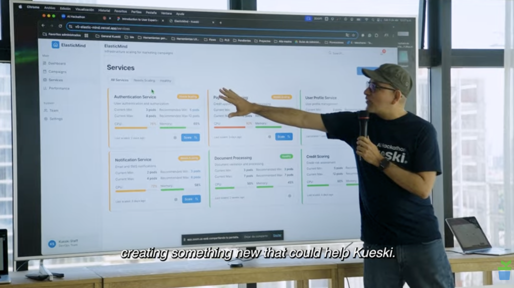
Bridging Design to Code: We partnered closely with a newly formed, dedicated engineering team tasked specifically with translating our design system into code. Together, we brought the components to life inside Storybook and a unified code repository.
Engineering a New Mobile Design System From Scratch
From weeks to days: By designing with a pre-validated component library, our velocity exploded.
The system dramatically increased our speed to prototype, test, and launch new ideas, condensing timelines that previously took weeks down to just days.
Balancing Vision with Technical Reality: Buying Time for Scale
Not everything went perfectly according to the initial playbook; we had to balance our ideal UX vision with real-world technical limitations. To bridge the gap, I strategically designed an interim "bridge" experience—a clever frontend solution that hid systemic complexity to protect the user from friction while buying our engineering teams the necessary runway to perform a deep, comprehensive backend re-architecture.
Culturally, navigating this wasn't without its hurdles, as several key stakeholders were initially resistant to altering our immediate product timeline for a structural overhaul. However, by frameing the discussion around long-term viability rather than quick fixes, I successfully persuaded leadership that investing in a deep technical and visual restructuring was the only way to sustainably scale our platform, reliably protect our users' emotional peace of mind, and robustly support Kueski’s future mobile roadmap.
Impact & Metrics
The complete redesign from 0 to launch successfully delivered a massive win-win for both our customers' peace of mind and the company's bottom line:
40% Reduction in Support Ticket Interactions: By eliminating UI confusion, clarifying outstanding balances, and providing precise post-payment tracking, we dramatically cut down support volumes
Accelerated Delivery Velocity by 2X: Shifted product delivery timelines from 60 days down to just 30 days average, by implementing a new Figma-to-Storybook component pipeline. Next step being getting the DS to be AI-ready.
Complete Funnel Visibility: Established absolute measurement accuracy over the repayment funnel using Amplitude and Databricks, enabling data-driven optimization.
Shift to Low-Cost Payment Channels: Successfully drove a 18% adoption rate increase toward Direct Debit on Demand, lowering transaction processing fees and improving net profit margins on repayments.
Increase in Customer Satisfaction (CSAT): Resolving the core anxieties around loan balances and payment statuses directly translated into an elevated customer experience.
The Final Redesign
The final interface for the Actividad section and repayment flows relies heavily on progressive disclosure. We stripped away unnecessary financial noise, focused the UI on the core balances due, and backed up the in-app states with clear automated emails and push notifications.
By designing with our pre-validated design system components, our team's velocity improved drastically, allowing us to prototype, test, and launch layout changes in days rather than weeks.
Personal mark on my team
Mario, I’ve had the opportunity to participate in the different challenges you’ve addressed over time, and you have consistently shown a genuine willingness to help and collaborate with the teams. The way you facilitate collaborative sessions that are open to feedback and idea sharing is greatly appreciated and creates safe spaces to discuss, iterate, and build better solutions. Additionally, your ability to work closely with Product and Engineering has made you a key partner for the team. Thank you very much for all your commitment and support to the team!
— Manuel Feria. Director of Software EngineeringYou transitioned into the Money Movements team in H1 and consistently demonstrated exceptional collaboration across roles and disciplines — PMs, engineers, and designers alike — as reflected in the glowing feedback from your teammates.
As Kueski’s most senior designer, you lead with humility and an open mind. Your inclusive leadership style shines through in peer feedback, and with you, feedback is always a two-way street. You listen attentively, incorporate input with grace and openness, and consistently offer thoughtful, constructive feedback to others in critiques — always delivered with kindness, a quality that has not gone unnoticed.
— Pierre Marly | Product Design Director